As part of migrating some dashboards to Power BI using the TDS Endpoint I hit a problem getting a chart to show correctly. I needed to show invoices with the values grouped by month. This is simple in a standard Dynamics chart, and when importing the data into Power BI. There are some limitations when using DirectQuery though that make it a bit more involved when coming from a Dynamics background.
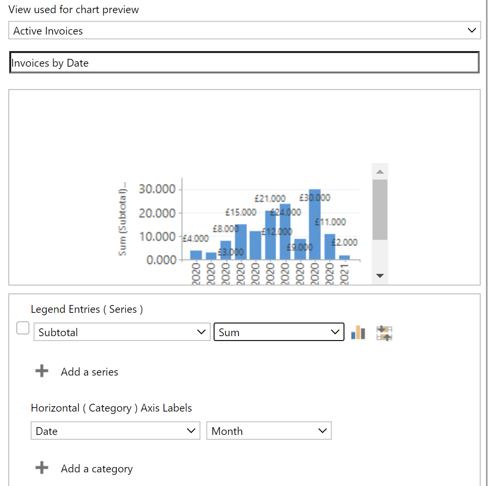
The chart in Dynamics looks like this:
As near as possible I want to get a like-for-like version in Power BI.
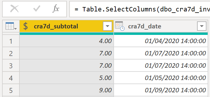
Connecting Power BI to the TDS endpoint is simple enough and I can access the invoice value and date:
What is a simple option in the Dynamics chart designer to group the data by month becomes a bit more awkward at this point in Power BI. When you use the Import mode (Power BI takes a regularly-refreshed copy of the Dynamics data) you get a lot of automatic intelligence for dates including hierarchies of date/month/year, but that’s not available when using DirectQuery mode (Power BI issues live queries against the TDS endpoint to get the latest data the user has access to).
So to start with my chart looks like:
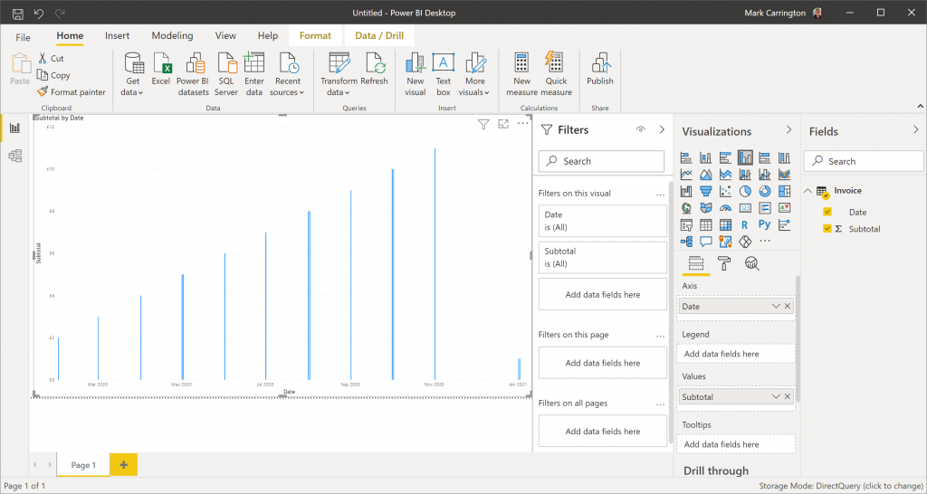
Not very helpful. Because the invoices all have slightly different times, each one is shown as a separate line on the chart. I need to introduce the date intelligence myself.
Date/time or Date?
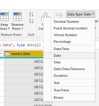
Firstly, the invoice date field contains a time component. This makes things difficult later on, so the first thing I want to do is strip it back to just the date. I can do this in Power Query by changing the column type to date:
= Table.TransformColumnTypes(#"Filtered Rows1",{{"Invoice Date", type date}})
Date Table
Next I need a date table. This is simply a table with one row per day. In my case I want this to start no later than the first invoice date and go right through to the current date.
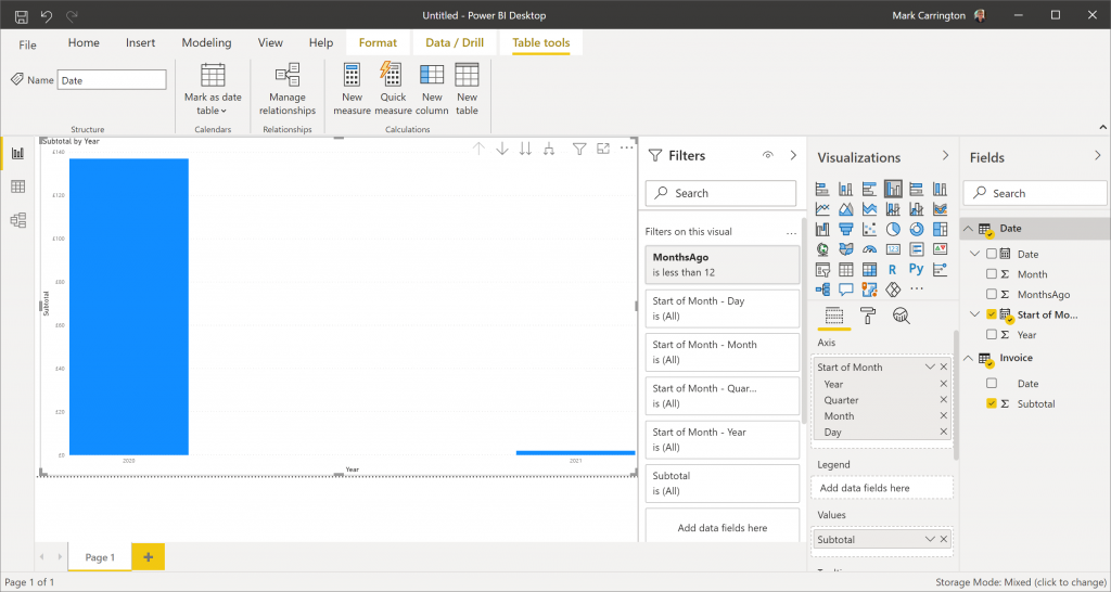
I’m going to use DAX to define my date table. This way the data for the table isn’t stored in my report, only the definition for it. From the Report view, go to the Modelling tab in the ribbon, click “New Table” and enter the table definition:
Date = CALENDAR(DATE(2001, 1, 1), TODAY())
This gets me a simple list of date values:
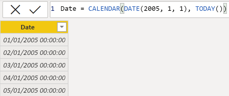
I can pick 01/01/2005 as the start date as I know I don’t have nay invoices before that, and I also know I don’t have any future-dated invoices. If you’re not sure of what start and end dates to use, you can use the CALENDARAUTO function instead. This scans all the date columns in your model and creates a list of dates between the minimum and maximum values it finds.
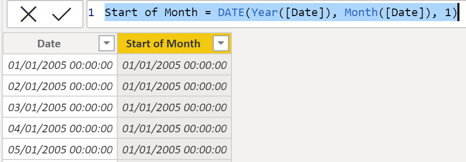
Now I’ve got a date column I can add a few more columns to help me later. Because I want to format my data by month, I’ll create a new column as:
Start of Month = DATE(Year([Date]), Month([Date]), 1)
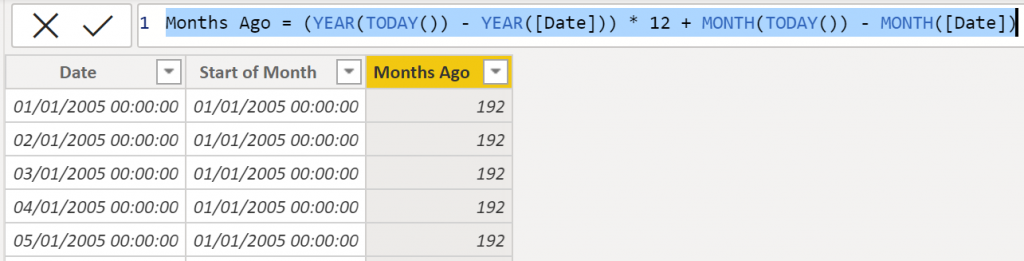
To do the filtering I need, I have to know how many months ago each date was. I can do this with another calculated column:
Months Ago = (YEAR(TODAY()) - YEAR([Date])) * 12 + MONTH(TODAY()) - MONTH([Date])
This works out the difference in months between the current date and the date in each row:
Joining the tables
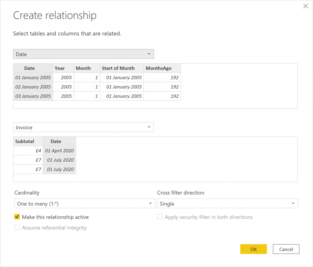
Now I’ve got my fact table (the list of invoices) with a simple date column, and my date table, I can join the two based on the dates by clicking the “Manage Relationships” button in the “Table tools” ribbon. Click “New” then select the tables and columns that form the relationship:
Filtering
My users want to see the last 12 months of data. What this means specifically is the last full 11 months, plus the current month to date. This is where the “MonthsAgo” column in the date table comes in useful. I can add a filter on my report to show records only where MonthsAgo is less than 12:
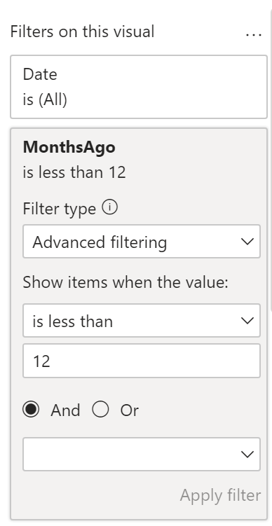
This will end up giving us the data we want, but the DirectQuery part of the model doesn’t know about these dates. If this is the only filter we add, Power BI will have to load in the entire history of invoices and then throw away those that don’t match the records in the date table in the last 12 months.
To make this more efficient (though see the note on performance later) we can add another filter on the invoice table’s Date column. We can’t get the Power BI relative date filtering to do exactly what we want here (we could select the last 12 months, which would give us a partial month at the start of the period as well as at the end, or the last 12 calendar months which ignores the current month to date), but we can add a filter that gets slightly more data than we need so there’s less wasted:
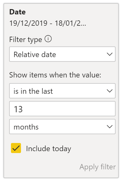
Chart Axis
I can also update the chart visual by replacing the Date column in the axis with the Start of Month column. Unlike the date column from the invoice table, which did not have any automatic hierarchy applied as it comes from a DirectQuery source, this one comes from a DAX calculated table and so this gets grouped automatically by year:
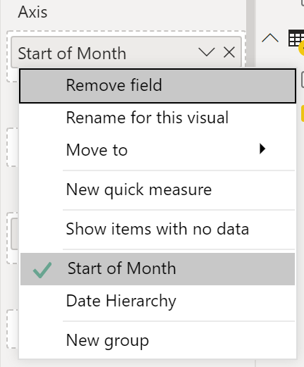
I want to show the totals by month, but removing the Year, Quarter and Day hierarchies in the Axis settings doesn’t quite get me what I want. The remaining Month hierarchy is just month, not month-and-year. This means January is displayed before February, even when I’m running this in January 2021 so I want January to come at the end.
Instead of using the default hierarchy view then, I need to switch to show the raw field. By right-clicking on the Start of Month field in the Axis settings and selecting the original field instead of the Date Hierarchy option:
This gives me a chart very similar to what I started with in Dynamics:
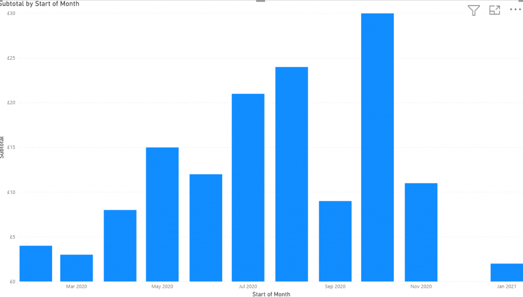
One useful thing I get here is the blank space for December 2020. If you look at my original chart closely you’ll notice that there was no gap there. Because there were no invoices in December, the Dynamics chart simply skips over the month entirely. In Power BI I’ve got a date table with entries for every date regardless of whether there are any invoices or not, so any gaps are shown correctly.
Performance
It’s worth pointing out the current performance problems with this. Accessing and filtering by date columns with the TDS endpoint comes with a hefty performance penalty. There is this note on the docs page currently:

Fingers crossed then that we’ll see this performing better soon, but until then you will notice much slower reports compared to import mode reports.